List design
The goal of this list design document is to establish an appropriate architecture and API design for the list widgets in the Apertis platform.
Historically, the roller widget has provided a list widget on a cylinder with no conceptual beginning or end and is manipulated naturally by the user. For non-cylindrical lists there was a separate widget with a different API and different usage. The goal is to consolidate list operations into a base class and be able to use the same simple API to use both cylindrical lists and non-cylindrical lists.

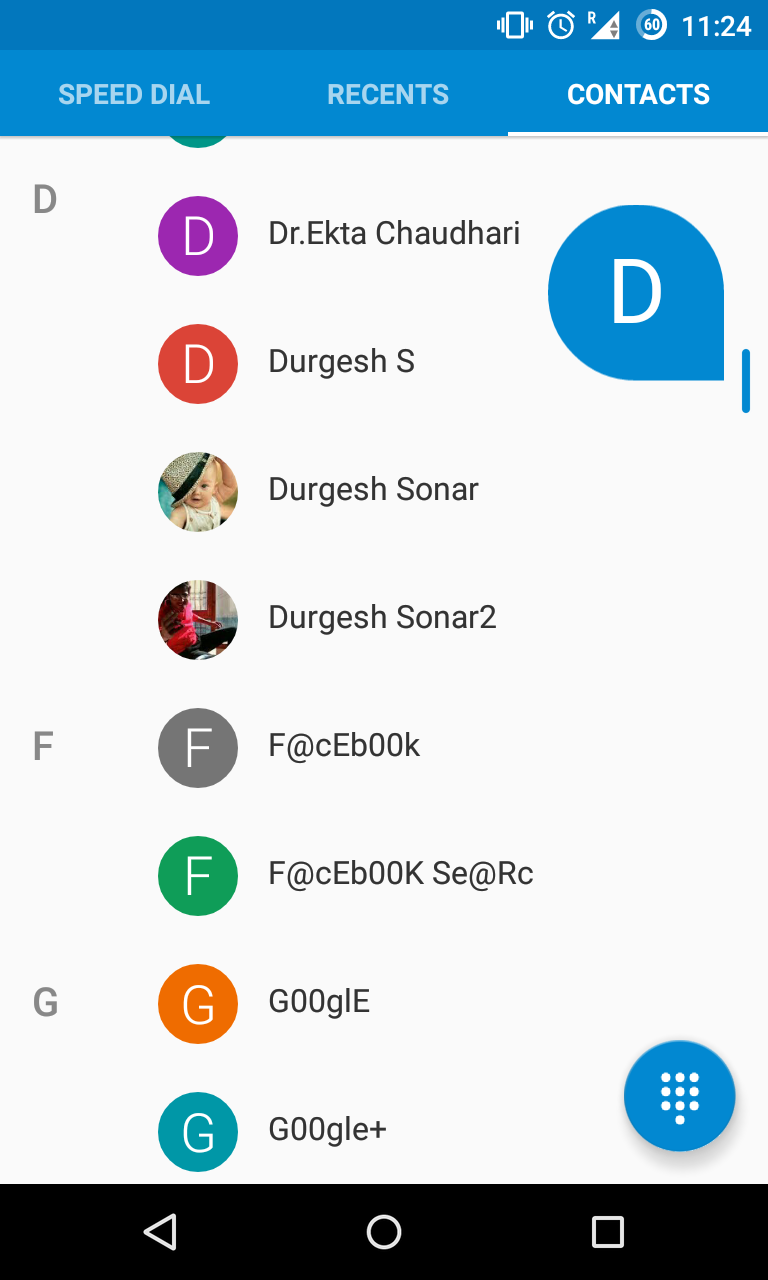
The above shows an example of the roller widget in use inside the music application. There are multiple roller widgets for showing album, artist, and song. Although they are manipulated independently, their contents are linked.
Terminology and concepts
Vehicle
For the purposes of this document, a vehicle may be a car, car trailer, motorbike, bus, truck tractor, truck trailer, agricultural tractor, or agricultural trailer, amongst other things.
System
The system is the infotainment computer in its entirety in place inside the vehicle.
User
The user is the person using the system, be it the driver of the vehicle or a passenger in the vehicle.
Widget
A widget is a reusable part of the user interface which can be changed depending on location and function.
User interface
The user interface is the group of all widgets in place in a certain layout to represent a specific use-case.
Roller
The roller is a list widget named after a cylinder which revolves around its central horizontal axis. As a result of being a cylinder it has no specific start and finish and appears endless.
Application author
The application author is the developer tasked with writing an application using the widgets described in this document. They cannot modify the variant or the user interface library.
Variant
A variant is a customised version of the system by a particular system integrator. Usually variants are personalised with particular colour schemes and logos and potentially different widget behaviour.
Use cases
A variety of use cases for list design are given below.
Common API
An application author wants to add a list widget to their application. At that moment it is not known whether a simple list widget or a roller widget will suit the application better. Said application author doesn't want to have a high overhead in migrating code from one widget to another.
MVC separation
A group of application authors wants to be able to split the work involved in developing their application into teams such that, adhering to the interfaces provided, they can develop the different parts of the application and easily put them together at the end.
Data backend agnosticity
An application author wishes to display data stored in a database, and does not want to duplicate this data in an intermediary data structure in order to do so.
Kinetic scrolling
The user wants to be able to scroll lists using their finger in such a way that the visual response of the list is as expected. Additionally, the system integrator wants the user to have visual feedback when the start or end of a list is reached by the list bouncing up and back down (the elastic effect). However, another system integrator wants to disable this effect.
The user expectations include the following:
-
The user expects the scroll to only occur after a natural threshold of movement (as opposed to a tap), for the list to continue scrolling after having removed their finger, and for the rate of scroll to decrease with time.
-
The user expects to be able to stop a scroll by tapping and holding the scrolling area.
-
The user expects a flick gesture to re-accelerate a scroll without any visible stops in the animation.
-
The user expects video elements to continue playing during a scroll.
-
When there are not enough items to fill the entire height of the list area the user expects a scroll to occur but using the elastic effect fall back to the centre.
-
The user expects a horizontal scroll gesture to not also scroll in the vertical direction.
Roller focus handling
In the roller widget, the user wants the concept of focus to be highlighted by the list scrolling such that the focused row is in the vertical centre.
Additionally, the user wants to be able to easily focus another unfocused visible item in the list simply by pressing it.
Animations
The user wants to have a smooth and natural experience in using either list widget. If the scrolling stops half-way into an item and it is required that one item is focused (seeroller focus handling), they want the list to bounce a small scroll to focus said item.
Item launching
An application author wants to be able to perform some application-specific behaviour in response to the selecting of an item in the list. However, they want to provide some confirmation before launching an item in a list. They want the two step process to be:
-
The desired item is focused by scrolling to it or tapping on it.
-
The focused item is tapped again which confirms the intention to launch it.
Header and footer
The application author wants to add a header to the column to make it clear exactly what is in said column. (An example can be seen in List design in the music application.)
Another system integrator wants the column names to be shown above the widget in a footer instead of a header.
Roller rollover
In the roller widget, by definition, the user wants to scroll from the last item in the list back to the first without having to go all the way back up.
Additionally, the user wants the wrap around to be made more visually obvious with increased resistance when scrolling past the fold between end and start again.
Widget size
The application author wants any list widget to expand into space allocated to it by its layout manager. If there are not enough items in the list to fill all available space said application author wants the remaining space to be blank, but still used by the list widget.
Click activation
A system integrator wants to choose between single click and double click activation (seeitem launching) for use in the list widgets. This is only expected once the item has already been focused (see alsoroller focus handling).
The decision of single or double click is given to the system integrator instead of the application author in order to retain a consistent user experience.
Consistent focus
The user focuses an item in the list and a new item is added. The user expects the new item not to change the scroll position of the list and more importantly not to change the currently focused row.
Focus animation
An application author wants an item in the list to be able to perform an animation after being focused.
Mutable list
An application author wants to be able to change the contents of a list shown in the user interface after having created the widget and shown it in the user interface.
UI customisation
A system integrator wants to change the look and feel of a list widget without having to change any of the application code.
Blur effect
A system integrator wants items in the list to be slightly blurred when scrolling fast to exaggerate the scrolling effect. Another system integrator wants to disable this blur.
Scrollbar
A system integrator wants a scrollbar to be visible for controlling the scrolling of the list. Another system integrator doesn't want the scrollbar visible.
Hardware scroll
A system integrator wants to use hardware buttons to facilitate moving the focus up and down the list. The system integrator wants the list to scroll in pages and for the focus to remain in order. For example, a list contains items A, B, C, and D. When the down hardware button down is pressed, the page moves down to show items E, F, G, and H, and the focus moves to item E as it is the first on the page.
On-demand item resource loading
The music application lists hundreds of albums but the application author doesn't want the album art thumbnail to be loaded for every item immediately as it would take too long and slow the system down. Instead, said application author wants album art thumbnail to load only once visible and have a placeholder picture in place until then.
Scroll bubbles
A system integrator wants bubbles to appear when scrolling and disappear when scrolling has stopped.
Item headers
An application author wants to display items in a list but have a logical separation into sections. For example, in a music application, listing all tracks of an artist and separating by album.
Another application author wants said headers to stick to the top of the widget so they are always visible, even if the first item has been scrolled past and is no longer visible.
List with tens of thousands of items
An application author wants to display a list containing thousands of items, but does not want to incur the initial cost of instantiating all the items when creating the list.
Flow layout
An application author wants the list widget to render as a grid with multiple items on the same line. The following video shows such a grid layout.
Concurrent presentation of the same model in different list widgets
An application author wants to present the same model in two side-by-side list widgets, possibly with different filtering or sorting.
Non-use cases
A variety of non-use cases for the list design are given below.
Tree views
An application author wants to show the filesystem hierarchy in their application. They understand that multi-dimension models (or trees) where items can be children of other items are not supported by the Apertis list widgets (hence the name list).
List widget without a backing model
An application wants to display a list of items in the list widget,
but does not wish to create a model and pass it to the list widget,
and would rather use helper functions in the list widget, such as
list_add_item(List *list, ListItem *item).
Such an interface is not considered necessary, at least for this version of the design document, because we want to encourage use of models so that the UI views themselves can be rearranged more easily.
If, in the future, such an interface was considered desirable, its
API should be similar to the GtkListBox API, such as
gtk_list_box_row_changed().
Sticky header and footer
An application developer wants an actor to stick to the top or the bottom of the list widget, and always be visible regardless of scrolling.
This is best handled as a separate actor, sharing a common parent with the list widget.
Requirements
Common API
There should be a common API between both list widgets (seecommon api). Changing from a list widget to a roller widget or the other way around should involve only trivial changes to the code leading to a change in behaviour.
MVC separation
The separation between components that use the list widgets should be functional and enable application authors and system integrators to swap out parts of applications easily and quickly (seemvc separation).
The implementation of the model should be of no impact to the functionality of the widget. As a result the widget should only refer to the model using an interface which all models can implement.
Data backend agnosticity
The widget should not require application authors to store their backing model in any particular way.
Kinetic scrolling
Both list widgets should support kinetic scrolling from user inputs (seekinetic scrolling). That is, when the user scrolls using their finger, he or she can flick the list up or down and the scroll will continue after the finger is released and gradually slow down. This animation should feel natural to the user as if he or she is moving a wheel up or down, with minimal friction. The animation should also be easily stopped by tapping once.
Elastic effect
In the list widget with a defined start and finish, on trying to scroll there should be visual feedback that the start or finish of the list has been reached. This visual feedback should be accomplished using the elastic effect. That is, when the bottom is reached and further downward scrolling is attempted, an empty space slowly appears with resistance, and pops back when the user releases their finger.
This is not necessary on the roller widget because the list loops and there is no defined start and finish to the list.
It should be easy to turn this feature off as it may be undesired by the system integrator (seekinetic scrolling).
Item focus
In both list and roller widgets there should be a concept of focus which only one item has at any one point. How to display which item has focus depends on the widget.
Roller focus handling
In the roller widget the focused item should always be in the vertical centre of the widget (seeroller focus handling). The focused item should visually change and even expand if necessary to demonstrate its focused state (see alsofocus animation).
Changing which item is focused should be possible by clicking on another item in the list.
Animations
It should be possible to add animations to widgets to allow for moving the current scroll location of the list up or down (seeanimations). This should be customisable by the system integrator and application author depending on the application in question but should retain the general look and feel across the entire system.
Item launching
Focused items (see Item focus) should be able to be launched using widget-specific bindings (clicks or touches) (see Click activation).
Header and footer
It should be possible to add a header to a list to provide more context as to what the information is showing (seeheader and footer and the screenshot in List design). This should be customisable by the application author and should be consistent across the entire system.
Roller rollover
The rollover of the two list widgets should be different and customisable by the system integrator (seeroller rollover andui customisation).
The roller widget should roll over from the end of the list back to the beginning again, like a cylinder would (see List design and Roller). Additionally the system integrator should be able to customise whether they want extra resistance in going back to the beginning. This is visual feedback to ensure the user knows they are returning to the beginning of the list.
The non-roller list widget should not have a rollover and should have a well-defined start and finish, with visual effects as appropriate (see Elastic effect).
Widget size
The list widgets should expand to fill out all space that has been provided to them (seewidget size). They should fill any space not required with a blank colour, specified by the variant UI customisation (seeui customisation).
Consistent focus
The focus of items in a list should remain consistent despite modification of the list contents (seeconsistent focus). Adding items before or after the currently focused item shouldn't change its focused state.
Focus animation
The application author and system integrator should be able to specify whether there is an animation in selecting an item in a list (seefocus animation andui customisation). This could mean expanding an item to make the item focused larger vertically and even display extra controls which were previously hidden under the fold.
During this animation, input should not be possible.
Mutable list
The items shown in the list widgets and their content should update dynamically when the model backing the widget is updated (seemutable list). This should require no extra effort on the part of the application author.
UI customisation
Both list widgets should be visibly customisable in the same way the rest of the system is and should honour UI customisations made by the system integrator (seeui customisation). In this way, the list widgets should use CSS (see the UI Customisation Design document) for styling.
Blur effect
The list widget should support slightly blurring list items only when scrolling (seeblur effect). It should be easily to disable this feature by another system integrator who doesn't want the blur.
Scrollbar
The list widget should support showing and hiding a scrollbar as necessary (seescrollbar). It should be easy to disable this feature by another system integrator who doesn't want to display a scrollbar.
Hardware scroll
The list widget should support scrolling using hardware buttons and therefore always have one item focused hardware scroll). Hardware button callbacks should use the adjustments on the list widget to change the subset of visible items and the appropriate list widget function for moving the focus to the next item. Hardware button signals are generated as described in the Hardkeys Design.
On-demand item resource loading
Items in the list need to know when they are visible (and not past the current scroll area) so they know when to load expensive resources, such as thumbnails from disk (see On-demand item resource loading).
Scroll bubbles
The scrollbar (see alsoscrollbar) should support showing bubbles to show the scroll position (seescroll bubbles). It should be possible to disable the bubble and change its appearance when necessary.
Item headers
It should be possible to add separating headers to sets of items in the list widgets (seeitem headers). Said headers should also be sticky if specified.
Lazy list model
It should be possible to provide a ‘lazy list store’ to the widget, in which items would be created on demand, when they need to be displayed to the user.
This model could make memory usage and instantiation performance independent of the number of items in the model.
See List with tens of thousands of items
Flow layout
It should be possible for n items, each of the same width and height, to be packed in the same row of the list, where n is calculated as the floor of the list width divided by the item width. There is no need for the programmer to set n manually.
Reusable model
The underlying model should not have to be duplicated in order to present it in multiple list widgets at the same time.
See Concurrent presentation of the same model in different list widgets
Approach
Adapter interface
As required bydata backend agnosticity1, the backing data model format should not be imposed by the list widget upon the application developer.
As such, an ‘adapter’ is required, similar to Android's ListAdapter, this
adapter will make the bridge between the list widget and the data that backs
the list, by formatting data from the underlying model as list item widgets
for rendering.
The following diagram illustrates how this adapter helps decoupling the list widget from the underlying model.

In the above example, we assume a program that simply displays a list widget exposing items stored in a database, and an adapter that stores strong references to the created list items, and will eventually cache them all if the list widget is fully scrolled down by the user. This is as opposed to the approach presented in Lazy list model where memory usage is also taken into account.
The ‘cursor’ is a representation of whatever database access API is in use, as most databases use cursor-based APIs for reading.
An interface for this adapter (the contents of the list widgets) is required such that it can be swapped out easily where necessary (seemvc separation, Lazy list model).
GLib recently (since version 2.44) added an interface for this very
task. GListModel is an implementation-agnostic interface for
representing lists in a single dimension. It does not support tree
models (see Tree views) and contains everything required for the
requirements specified in this document.
It should be noted that GListModel, which is for arbitrary containers, is
entirely unrelated to the GList data structure, which is for doubly linked
lists.
In addition to functions for accessing the contents of the adapter, there is
also an items-changed signal for notifying the view (the list widget and list
item widgets it contains; seemvc separation)
that it should re-render as a result of something changing in the adapter.
GtkListBox
GtkListBox is a GTK+ widget added in 3.10 as a replacement for the
very complicated GtkTreeView widget. GtkTreeView is used for
displaying complex trees with customisable cell renderers, but more
often lists are used instead of trees.
GtkListBox doesn't have a separate model backing it (but one can be
used), and each item is a GtkListBoxRow (which is in turn a GtkWidget).
This makes using the widget and modifying its contents especially easy
using the GtkContainer functions. Items can be activated (seeitem launching or selected (see Item focus).
GtkListBox has been used in many GNOME applications since its addition
and has shown that its API is sufficient for most simple use cases, with
a limited number of items.
However GtkListBox is not scalable, as its interface requires that all its
rows be instantiated at initialisation, in order for example to add headers
to sections, and still be able to scroll accurately to any random position
in the list (random access).
As such, its API is only of a limited interest to us, particularly when it comes toitem headers orfiltering.
GtkFlowBox
[GtkFlowBox] is a GTK+ widget added in 3.12 as a complement to GtkListBox.
Its API takes a similar approach to that of GtkListBox: it doesn't have a
separate model backing it – but one can be used – and each item is a
GtkFlowBoxChild which contains the content for that item.
As with GtkListBox, its API is interesting to us for its approach to
reflowing children; see Column layout.
Widget size
The list widgets should expand to fill space assigned to them (seewidget size). This means that when there are too few items to fill space the remaining space should be filled appropriately, but when there are more items than can be shown at one time the list should be put into a scrolling container.
In Clutter, actors are made to expand to fill the space they have been
assigned by setting the x-expand and y-expand properties on
ClutterActor. For example:
|
|
More details can be found in the ClutterActor documentation.
The list item widgets (as described inadaptermodel implementation) are packed by the list widget and so application authors have no control over their expanding or alignment.
A suitable scrolling container to put a list widget into is the
MxKineticScrollView as it provides kinetic scrolling (seekinetic scrolling
and Elastic effect) using touch events. Additionally, the
MxKineticScrollView should be put into an MxScrollView to get a
scrollbar where appropriate (seescrollbar).
For support of MxKineticScrollView the list widgets should implement the
MxScrollable interface, which allows getting and setting the
adjustments, and is necessary in showing a viewport into the interface
The exact dimensions in pixels for the widget shouldn't be specified by the application author as it means changes to the appearance desired by a system integrator are much more difficult to achieve.
Adapter/Model implementation
As highlighted before (in Adapter interface), the list widget should make no assumption about how the backing data is stored. An adapter data structure should be provided, making the bridge between the backing data and the list widget, by returning list item actors for any given position.
The GListModel interface requires all its contained items to be
GObjects with the same GType.
It is suggested that the items themselves are all instances of a new
ListItem class, which will inherit from ClutterActor, and implement
selection and activation logic.
GListStore is an object in GLib which implements GListModel. It
provides functions for inserting and appending items to the model but no
more. For small lists, it is suggested to either use GListStore directly or
implement a thin subclass to give more type safety and better-adapted function
signatures.
In these simple cases, GListStore will act as both the adapter and the
backing model, as it is storing ListItem widgets. For more complicated use
cases (where the same data source is being used by multiple list widgets), the
adapter and backing model must be separated, and hence GListStore is not
appropriate as the adapter in those cases. See Decoupled model.
Decoupled model
As shown in Adapter interface, the list widget will not directly interact with the underlying data model, but through an ‘adapter’.
The following diagram shows how the same underlying model may be queried by two different list widgets, and their corresponding adapters.

List widgets are the outermost boxes in the diagram; the adapters are the next boxes inwards; and the middle box is the shared data model (a database).
The ‘cursors’ in the above diagram are a representation of whatever database access API is in use, as most databases use cursor-based APIs for reading.
Lazy object creation
GListModel allows an implementation to create items lazily (only create
or update items on screen and next to be displayed when a scroll is
initiated) for performance reasons. This is recommended for applications
with a very large number of items, so a new ListItem isn't required for
every single item in the list at initialisation.
GListStore does not support lazy object creation so an alternative model
will need to be implemented by applications which need to deal with
huge models.
An example for this is provided in Alternative list adapter.
High-level helpers
Higher-level API should be provided in order to facilitate common usage scenarios, in the form of an adapter implementation.
This adapter should be instantiatable from various common data models, through
constructors such as: list_adapter_new_from_g_list_model or
list_adapter_new_from_g_list.
This default adapter should automatically generate an appropriate UI for
the individual objects contained in the data model, with the only requirement
that they all be instances of the same GObject subclass. This requirement
should be clearly documented, as it won't be possible to enforce it at
instantiation time for certain data models, such as GList, without iterating
on all its nodes, thus forbidding the generic adapter from adopting a lazy
loading strategy.
The default behaviour of the adapter should be to provide a UI for all the
properties exposed by the objects (provided it knows how to handle them),
but much like the Django admin site, it should be easy
for the user to modify which of these properties are displayed, and the
order in which they should be displayed, using a set_fields() method. The
suggested set_fields() API would take a non-empty ordered list of property
names for the properties of the objects in the model which the adapter should
display. For example, if the model contains objects which represent music
artists, and each of those objects has name, genre and photo properties,
the adapter would try to create row widgets which display all three
properties. If set_fields (['name', 'genre']) were called on the adapter, it
would instead try to only display the name and genre for the artist (name first,
genre second), and not their photo. The layout algorithm used for presenting
these properties generically in the UI is not prescribed here.
This generic adapter should expose virtual methods to allow potential
subclasses to provide their own list item widgets for properties that may or
may not be handled by the default implementation, and to provide their own list
item widgets for each of the GObjects in the model. These are represented by
create_view_for_property() and create_view_for_object() on the
API diagram.
The adapter should use weak references on the created list items, as examplified in Alternative list adapter.
Filtering and sorting should be implemented by this adapter, with the option for the user to provide implementations of the sorting and filtering methods, and to trigger the sorting and filtering of the adapter. It should be clearly documented that these operations may be expensive, as the adapter will have no other option than iterating over the whole model.
If developers want to use the list widget with an underlying model that allows more efficient sorting and filtering (for example a database), they should implement their own adapter.
Refer to the API diagram for a more formal view of the proposed API, and to the Generic adapter section for a practical usage example.
UI customisation
The list and list item widgets should be ApertisWidget subclasses (which
are in turn ClutterActors) to take advantage of the GtkApertisStylable
mixin that ApertisWidget uses. This adds support for styling the widget
using CSS and other style providers which can be customised by
system integrators.
As the list item widgets are customisable widgets, they can appear any way the application author wants. This means that it is up to the application author to decide on theming decisions. Apertis-provided list item widgets will clearly document the CSS classes that affect their appearance.
Sorting
Sorting the model is built into the GListStore. When adding a new item
to the adapter g_list_store_insert_sorted is used with the third
argument pointing to a function to help sort the model. All items can be
sorted at once using the g_list_store_sort function, passing in the
same or different sorting function.
When using an Alternative list adapter, sorting will need to be implemented on a case-by-case basis.
Filtering
As with GtkListBox when bound to a model, filtering should be implemented
by updating the contents of the adapter.
The list widget will be connected to the adapter, and will update itself appropriately when notified of changes.
An example of this is shown in the next section, the following diagram illustrates the filtering process.

The ‘cursors’ in the above diagram are a representation of whatever database access API is in use, as most databases use cursor-based APIs for reading.
Header and footer
The header should be a regular ApertisWidget, passed to the list widget as a
header property. It will be rendered above the body of the list widget.
Similarly, an ApertisWidget passed to a footer property will be rendered
below the body of the list widget. Using arbitrary widgets means the header’s
appearance is easily customisable. Passing them to the list widget means that
the list widget can set the widgets’ width to match that of the list.
Applications can set either, both, or neither, of the header and footer
properties. If both are set, both a header and a footer are rendered, and the
application may use different widgets in each.
Selections
As with GtkListBox, it should be possible to select either one or many
items in the list (see Item focus). The application author can decide
what is the behaviour of the list in question using the “selection
mode”. The values for the selection mode are none (no items can be
selected), single (at most one item can be selected), and multiple (any
number of items can be selected). A multiple selection example can be found
in the Multiple selection section.
The ListItem object has a read-write property for determining it can be
selected or not. An example that sets this property can be found
in the Non-selectable items section.
The selection signals exposed by the list widget will be identical to those
exposed by GtkListBox, namely item-selected when an item is focused,
item-activated when the item is subsequently activated, and in the case
of multiple selection, the selected-items-changed signal will give the user
the full picture of the current items selected by the user, by being emitted
every time the current selection changes, and passing an updated list of
selected list items to potential callback functions.
Item headers
Item headers are widgets used to separate items into logical groups (for example, when showing tracks of an artist, they could be grouped in albums with the album name as the item header).
Due to the requirement for lazy initialisation, the solution proposed
by GtkListBox cannot be adopted here, as it implies that all the list
items need to be instantiated ahead of time.
Our approach here is similar to the solution used
with Android's ListAdapter: as the adapter is decoupled from the data model,
and returns the actors that should be placed at a given position in the list,
it may also account for such headers, which should be returned as unselectable
ListItems at specific positions in the adapter.
We make no assumptions as to how implementations may choose to associate a selected list item with the data model: in the simple case, the index of a list item may be directly usable to access the backing object it represents, if the backing data is stored in an array, and no item header is inserted in the adapter.
In other cases, where for example the backing data is stored in a database,
or item headers are inserted and offset the indices of the following items,
implementations may choose to store a reference to the backing object using
g_object_set_qdata or an external mechanism such as a GHashTable.
An example of item headers is shown in [the following section][Header items].
Sticky item headers
As required for Lazy list model, when the list widget is scrolled to a random point, items surrounding the viewport may not be created yet.
It is proposed that a simple API be exposed to let application developers
specify the sticky item at any point in the scrolling process, named
list_set_sticky_func.
The implementation will, upon scrolling the list widget, pass this function
the index of the top-most visible item, and expect it to return the ListItem
that should be stickied (or NULL).
Blur effect
Given the MxKineticScrollView container does the actual scrolling, it is
the best place to implement the desired blur effect (seeblur effect).
Additionally, implementing it in the container means it can be
implemented once instead of in every widget that needs to have a blur
effect.
On-demand item resource loading
By default, list items should assume they are not in view and should not perform expensive operations until they have been signalled by the list widget that they are in view (see On-demand item resource loading). For example, a music application might have a long list of albums and each item has the album cover showing. Instead of loading every single album cover when creating the list, each list item should use a default dummy picture in its place. When the user scrolls the list, revealing previously hidden items, the album cover should be loaded and the default dummy picture replaced with the newly loaded picture.
The list widget should have a way of determining the item from given co-ordinates so that it can signal to said item when it comes into view after a scroll event. The list item object should only perform expensive operations when it has come into view, by reading and monitoring a property on itself. Once visible an item will not return to the not visible state.
Scroll bubbles
The bubble displayed when scrolling to indicate in which category the
scroll is showing (seescroll bubbles) should be added to MxScrollBar as
that is the widget that controls changing the scroll position.
Roller subclass
The roller widget should be implemented as a subclass of the list widget.
The roller widget will implement the MxScrollable interface, setting
appropriate increment values on its adjustments, in order to ensure the
currently-focused row will always be aligned with the middle after scrolling.
As the roller subclass will implement rollover, the elastic effect when reaching the bottom of the list will not be used.
In addition, it will also, in its init method, use a ClutterEffect in
order to render itself as a cylinder (or ideally, as a hexagonal prism).
Column layout
By default, the list widget will display as many items as fit per row, given the list’s width and the configured item width. Properties will be provided for:
- A
row-spacingproperty, setting the blank space between adjacent rows. - A
column-spacingproperty, setting the blank space between adjacent columns. - An
item-widthproperty, setting the width of all columns. - An
item-heightproperty, setting the height of all rows.
Note that GtkFlowBox supports reflowing children of different sizes; in this
design, we only consider children of equal sizes, which simplifies the API. It
is equivalent to considering a GtkFlowBox with its homogeneous property set
to true.
So, for example, to display items in a single column (one item per row), set the
item-width to equal the list’s width. To implement a grid layout where some
items may be missing and gaps should be left for them, implement a custom row
widget which displays its own children in a grid; and display one such row
widget per row of the list.
We suggest the default value for item-width is to track the list’s width, so
that the list uses a single column unless otherwise specified.
Focus animation
A use-animations property will be exposed on the list items. Upon activation,
an item with this property set to True will be animated to cover the whole
width and height allocated to the list widget.
Application developers may connect to the item-activated signal in order to
update the contents of the item, as shown in Item activation.
Once the set of possible and valuable animations has become clearer, API may be exposed to give more control to system integrators and application developers.
Item launching
In the roller subclass, the item-activated signal should only be emitted
for actors in the currently focused row. This will ensure that only items
that were scrolled to can be activated.
API diagram

Signals are shown with a hash beforehand (for example, #item-activated),
with arguments listed afterwards. Properties are shown with a plus sign
beforehand and without getters or setters (get_model(), set_model())
for brevity.
Example API usage
Basic usage
The following example creates a model, creates item actors for each artist available on the system, and adds them to the model. The exact API is purely an example but the approach to the API is to note.
As a simple example, this avoids creating a separate adapter and model, and instead creates a model which contains the list row widgets. In more complex examples, where data from the model is being used by multiple list widgets, the model and adapter are separate, and the entries in the model are not necessarily widget objects. See [Generic adapter] for such an example.
{{ ../examples/sample-list-api-usage-basic.c }}
The object created by create_sample_artist_item is an instance of
ClutterActor (or an instance of a subclass) which defines how the item
will display in the list. In that case, it is as simple as packing in a
ClutterText to display the name of the artist as a string.
More likely it would use a ClutterBoxLayout layout manager to pack
different ClutterActors into a horizontal line showing properties of the
artist.
Item activation
The following example creates a list widget using the function defined
in the previous section and connects to the item-activated signal to
change the list item actor.
{{ ../examples/sample-list-api-usage-item-activated.c }}
Filtering
The following example shows how to filter the list store bound to the list widget created using the function implemented in Basic usage to only display items with a specific property.
{{ ../examples/sample-list-api-usage-filtering.c }}
Multiple selection
The following example sets the selection mode to allow multiple items to be simultaneously selected.
{{ ../examples/sample-list-api-usage-selection.c }}
Non-selectable items
The following example makes half the items in a list impossible to select.
{{ ../examples/sample-list-api-usage-non-selectable-items.c }}
Header items
The following example adds alphabetical header items to the list.
{{ ../examples/sample-list-api-usage-header-items.c }}
On-demand item resource loading
The following example shows how on-demand item resource loading could be implemented, using the model created in the first listing:
{{ ../examples/sample-list-api-usage-resource-loading.c }}
Generic adapter
The following example shows how developers may take advantage of the proposed generic adapter.
{{ ../examples/sample-list-adapter-api-usage.c }}
Alternative list adapter
Authors of applications do not necessarily need to use a GListStore as their
adapter class. Instead they can implement the GListModel interface, and
pass it as the adapter for the list widget.
In the following example, we define and implement an adapter to optimise
both initialisation performance by creating MyArtistItems only when required,
and memory usage by letting the List widget assume ownership of the created
items.
{{ ../examples/alternative_list_model.c }}
Requirements
This design fulfils the following requirements:
-common api1 — the list widget and roller widget have the same API and any roller-specific roller API is in its own class.
-mvc separation1 — GListModel is used as an adapter to the backing
data, which storage format is not imposed to the user. The list widget
and item widgets are separate objects.
-data backend agnosticity1 — Applications provide list items through an adapter, no requirement is made as to the storage format.
-kinetic scrolling1 — use MxKineticScrollView.
-
Elastic effect — use
MxKineticScrollView. -
Item focus — list items can be selected ( Selections).
-roller focus handling1 — this roller-specific selecting behaviour can be added to the roller's class.
-animations1 — use MxKineticScrollView.
-item launching1 — the item-activated signal on the list widget will signal when an item is activated.
-header and footer1 — ApertisWidgets can be set as header or footer
header and footer2).
-roller rollover1 — this roller-specific rollover behaviour can be added to the roller's class.
-widget size1 — use ClutterLayoutManager and the ClutterActor
properties widget size2).
-consistent focus1 — the API asserts a consistent focus and ensures the implementation behaves when the model changes.
-focus animation1 — items are ClutterActors which can animate
using regular Clutter API.
-mutable list1 — use GListStore.
-ui customisation1 — subclass ApertisWidget and use the
GtkStyleProviders.
-blur effect1 — add a motion-blur property to
MxKineticScrollView and use that blur effect2).
-scrollbar1 — use the scroll-visibility property on the
MxScrollView container.
-hardware scroll1 — use the adjustment on the list widget to scroll down a page, and use the appropriate function to move the selection on.
- On-demand item resource loading1 — ensure list widget can look up the item based on co-ordinates, and add a property to the list item object to denote whether it’s in view, which the list widget updates.
-scroll bubbles1 — add support for overlay actors to
MxScrollBar.
-item headers1 — Added as regular ListItems in the adapter, a
list_set_sticky_func API is exposed.
-
Lazy list model — see Alternative list adapter, for an example of how application developers may implement their own model.
-
Flow layout — The number of columns is calculated by dividing the list width by the specified item width. Padding between the resulting columns and rows may be specified using
row-spacingandcolumn-spacingproperties.
Summary of recommendations
As discussed in the above sections, we recommend:
-
Write a list widget partially based on
GtkListBox, which subclassesApertisWidget. -
Write a list item widget partially based on
GtkListBoxRowwhich also subclasses ApertisWidget. -
Add a
motion-blurproperty toMxKineticScrollView. -
Expose a sticky item callback registration method.
-
Add support for overlay actors to
MxScrollBar. -
Write a Roller widget as a list widget subclass.
-
Ensure new widgets are easily customisable using CSS.
-
Add demo programs for the new widgets.
-
Define unit tests to run manually using the example programs to check the widgets work correctly.
Appendix
Existing roller design

